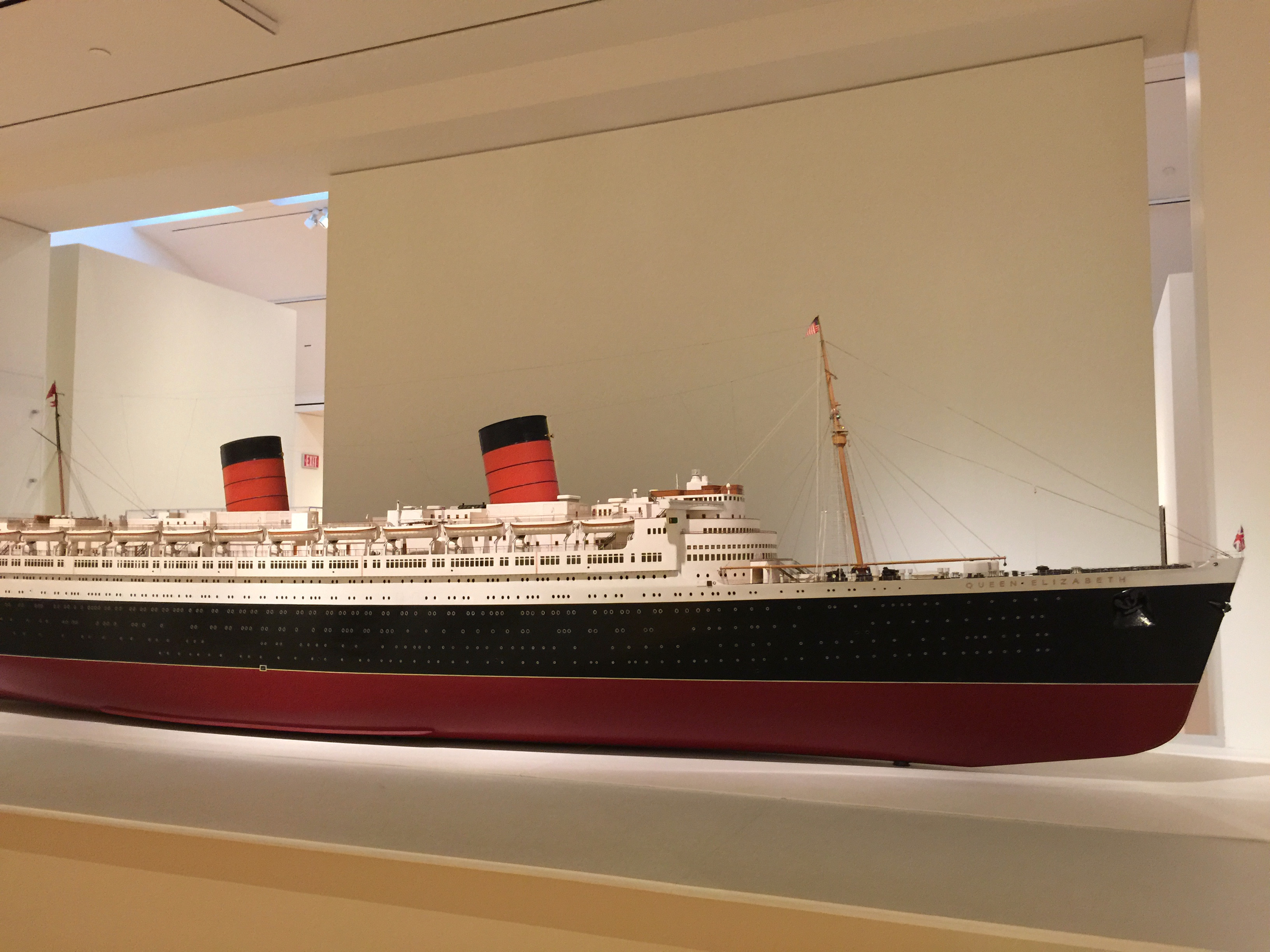
Leaving a museum with some sense of wonderment is part of the purpose of going.
Exhibit design is a big part of creating that sense of wonderment. It’s a complex subject because it depends on lighting, arrangement, how items get hung, displayed, and labeled.
I want to talk about text and labeling because we often wind up doing displays or exhibits in locations that lack what might be expected in a regular museum or gallery context. For example, when I was in practice as an applied anthropologist working with non-traditional settings for exhibits was the rule. Frequently lighting was limited and wall or aisle space “challenging.” But since the invention of the computer and the computer printer, labeling and creating text for exhibits has become more accessible and cheaper. If you are limited in lighting and space, good text and labeling can give visitors the impetus to stay, enjoy, and learn from the exhibit.
My introduction to this came via a semi-retired museum professional named Rennie Little. I had known Rennie through his time as an Executive Director at a local historical society. Over lunch one afternoon, Rennie outlined some basic concepts of labeling for exhibits. His theory was that there were three types of exhibit visitors: the Streakers, Strollers, and the Browsers. To be effective, you had to design text and labeling for all three.
- The Streaker was running through the exhibit. For the Streaker, you wanted to provide larger text covering basics; they might return to browse, but right now, they were in a hurry.
- The Stroller was taking their time but not too interested in details. Good general labeling on accreditation, dates, place, and such was sufficient for them.
- The Browser was taking its time. They were interested in detail on methods, materials, historical context, and much more. Leave out important information and be confronted by an irascible visitor.
Streakers and Strollers can become Browsers given opportunity and labeling that draws them into the deeper context, ignore one or the other, and prepare to lose all three.
Knowing that I had received good advice, I paid for lunch and paid attention to good labeling.
You don’t need to be a museum professional to grasp these basics. For example, you may be called upon to organize an exhibit – for a local society, family group, or business. The chances are that you’ll have limited lighting, space, and budget. But if you have a computer and a printer, good descriptive and informative labeling can make you successful.*
FYI: A couple of basic hints on text – no fancy fonts, go for readability; use simple declarative sentences where possible; and write at a sixth grade reading level for the general public.
Discover more from Louis N. Carreras, Woodcarver
Subscribe to get the latest posts sent to your email.

